Cheap logos from crowdsourcing platforms (like 99Designs) are often wrought with issues. With ethical, legal, and creative pitfalls, I want to share an alternative solution — a DIY.
Once you have your brand colors and typography chosen, it’s pretty simple to create your own logo.
And with affordable tools like Canva, you don’t need designer experience to produce quality designs. Canva event lets you upload purchased fonts if you have a pro account.
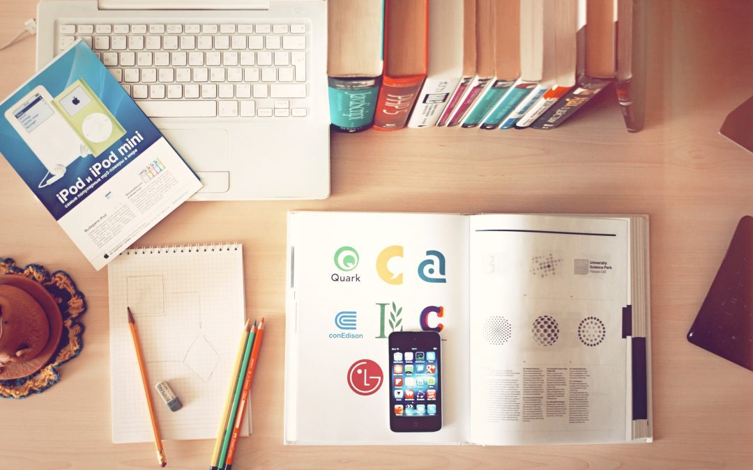
Types of Logos — Word Marks, Icons, and Lockups
There are many types of logos, including text marks, icons, and combination marks.
A logotype, also known as a text mark, is the simplest to DIY, so that’s what we’ll explore here. There are two variations of text marks: a word mark and a letter mark.
Word marks use an entire word or name of your brand. Letter marks truncate longer words into acronyms, initials, monograms, or even just a single letter.
Combining Color and Typography
We’ve already laid the foundation for your logo with colors and typography. Now we can combine them to create a simple logotype or letter mark.
These are the color and type palettes we’ll use for this example:

1. Start with Your Header Font
When choosing typography, we selected between one and three fonts. Here we’ll leverage your more playful font(s).
If you have a very long brand name, you might consider a letter mark from an acronym or other abbreviation.
Begin by typing out the name of your business in this primary font.
2. Add Some Color
Next, use your primary color for a single-color logo. If it feels a little flat, use a secondary color to add a pop on a small part of the graphic form.
3. Add a Slogan or Tagline
Once you have a main logotype, you might add some interest with a tagline. This might simply explain what your business does, like this example. Or it may be a slogan or catchphrase used across your branding.
Variations
You’ve now created your primary logo. Congrats! To cover all your bases across various platforms, you’ll also want a few variations.
Icon
A great way to DIY an identifiable icon is to choose one letter, or a monogram, of your brand name and create a letter mark.
You’ll use icons in very small (usually square) spaces, like social media or email profiles.
Stacked vs Horizontal
Depending on the materials you produce, you’ll likely need some variation in height to width ratio. One of these is probably covered already in your primary logo, but be sure to include the opposite, as well.
Website banners usually call for extended horizontal formats — there is generally plenty of horizontal space, but you’ll want to optimize vertical space for legibility.
In spaces with limited horizontal space, a stacked logo is important. These may or may not be square; if rectangular, it could be either vertical or horizontal. The main point is that the horizontal and vertical dimensions are fairly similar.
Building a Logo Suite
Another level deeper, a logo suite is good to have prepared. This is optional, but you will likely need these files at some time for different marketing formats.
File Types
There are many file types you’ll hear about for logos. I’ll add a resource on file types soon, but for now just touch on important points for logos.
Vector files (usually EPS) use mathematical formulas to display content, so they’re easy to scale. These are your foundation files and will be used over and over again. Adobe Illustrator is a standard application to export vector files.
Note: as of writing, Canva does not export EPS files, so you’ll want to export a large-scale file if exporting from there. See raster files below to understand the limitations.
PDF files may also be vectors, though it depends on how the original file is created.
Raster files (usually PNG or JPG) use pixels in a grid to display content. If you’re familiar with cross stitch artwork, this is a great representation of a raster or pixel format.
These files do not scale up (become bigger) well so must be exported in specific dimensions. They are, however, required for online applications. Note: if you cannot create vector files, create a raster at the larges size you expect to ever use. Just know that larger dimensions create larger file sizes.
PNGs have the option for a transparent background, but produce larger file sizes. JPGs have better compression, but must have a solid color background (white is the default).
Logo Variations
Variations are important to have on hand. You’ll want a variety of file types, both in full color, single-color (often black), and white. In general, you will want these 18–27 files in your brand kit:
EPS Files (transparent background)
| Full Color | ◻︎ Horizontal | ◻︎ Stacked | ◻︎ Icon |
| One Color | ◻︎ Horizontal | ◻︎ Stacked | ◻︎ Icon |
| White | ◻︎ Horizontal | ◻︎ Stacked | ◻︎ Icon |
PNG Files (transparent background)
| Full Color | ◻︎ Horizontal | ◻︎ Stacked | ◻︎ Icon |
| One Color | ◻︎ Horizontal | ◻︎ Stacked | ◻︎ Icon |
| White | ◻︎ Horizontal | ◻︎ Stacked | ◻︎ Icon |
JPG Files (optional — solid background)
| Full Color | ◻︎ Horizontal | ◻︎ Stacked | ◻︎ Icon |
| One Color | ◻︎ Horizontal | ◻︎ Stacked | ◻︎ Icon |
| White | ◻︎ Horizontal | ◻︎ Stacked | ◻︎ Icon |
How'd You Do?
If you’re stuck at any point along this DIY path, reach out! A la carte coaching is great to get quick insight along the way.
Shoot me an email, or schedule a free consult to decide what’s best for you.