Color is arguably the most powerful subconscious element of your branding. The colors you choose and how they interact sets the overall tone and mood for everything customers see.
And while you’ve probably heard a few basics of color psychology (i.e., blue is a “trustworthy” color — hence its (over-)use for law firms and the like), there is a lot of play in how colors are specifically applied.
But you don’t need a degree in color theory to find a palette that works. Our goal in this exercise is to select 3-5 colors to build your brand foundation.
Getting Started
Before diving right in, reflect back on your 3 Words. What is the tone you want to convey? How do you want your customers to feel when they experience the brand? Once you’ve established your baseline, look for an image that evokes that emotion in you.
Use Your Wardrobe
For personal brands, I might suggest looking at your wardrobe — it’s likely full of colors that represent your personality, even if unintentionally. Try taking a photograph of your favorite outfit, or of several pieces laid out together. Then use the trends or favorite color(s) to plug in a complimentary scheme in a color selector like color.adobe.com (see below).
Reference a Piece of Art
Businesses or corporations may have a favorite piece of art hanging in the office (or one you’d like to hang). Well-decorated physical spaces can also strongly influence emotions. Try using either a particular statement piece (like a throw pillow) or a wide-angle view of an area for inspiration.
If you’re still feeling stuck, jump on Google or a stock photo website and search your actual 3 Words. Feel free to allow your search to morph until you find an image that really represents your full intent.
A note on copyright: it is entirely legal to use any of these images for color inspiration without buying them. However, if you plan to use an image itself in your materials, be sure to pay the creator for usage rights.
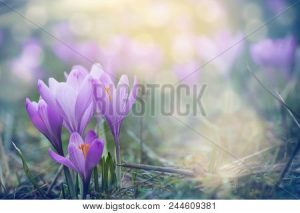
I’m going to use this one below as an example. It makes me feel calm, warm, and optimistic.
The important part of these examples is that you have a snapshot that evokes a particular feeling, one that parallels your original 3 Words. From here you can select a family of colors to represent your brand.
Free Color Selector
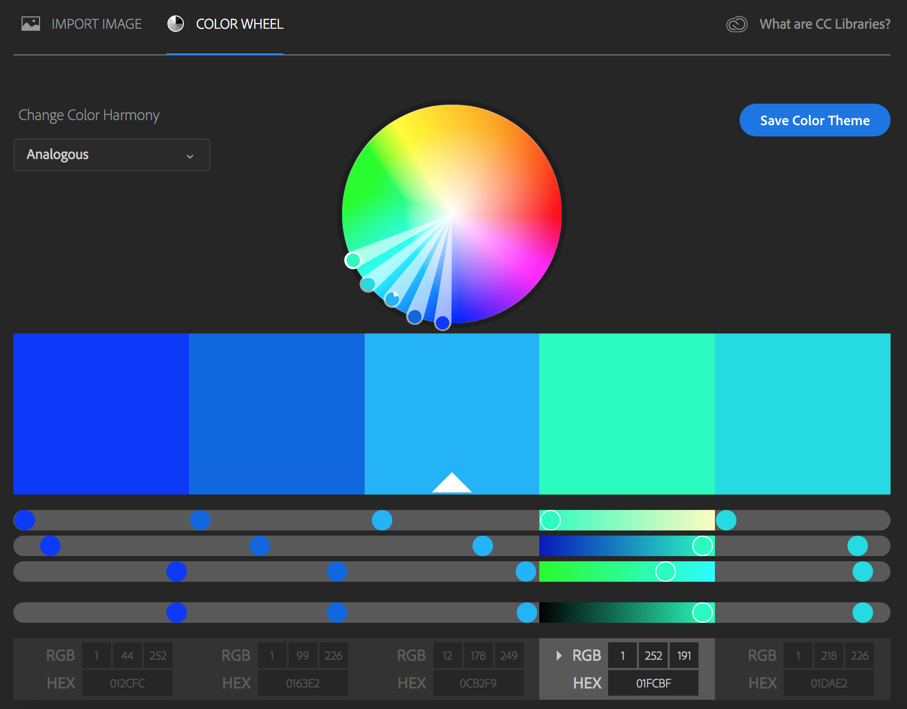
My favorite tool for starting a color palette is Adobe Color CC. It’s entirely free to use, and gives visitors both a simple, easy-to-use interface along with plenty of customization.
Pulling Colors From a Photo
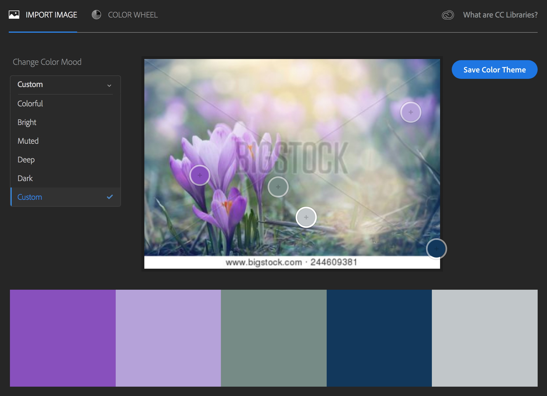
Remember that snapshot I said to grab for inspiration? Literally upload (or download) that photo onto your computer, then visit color.adobe.com.
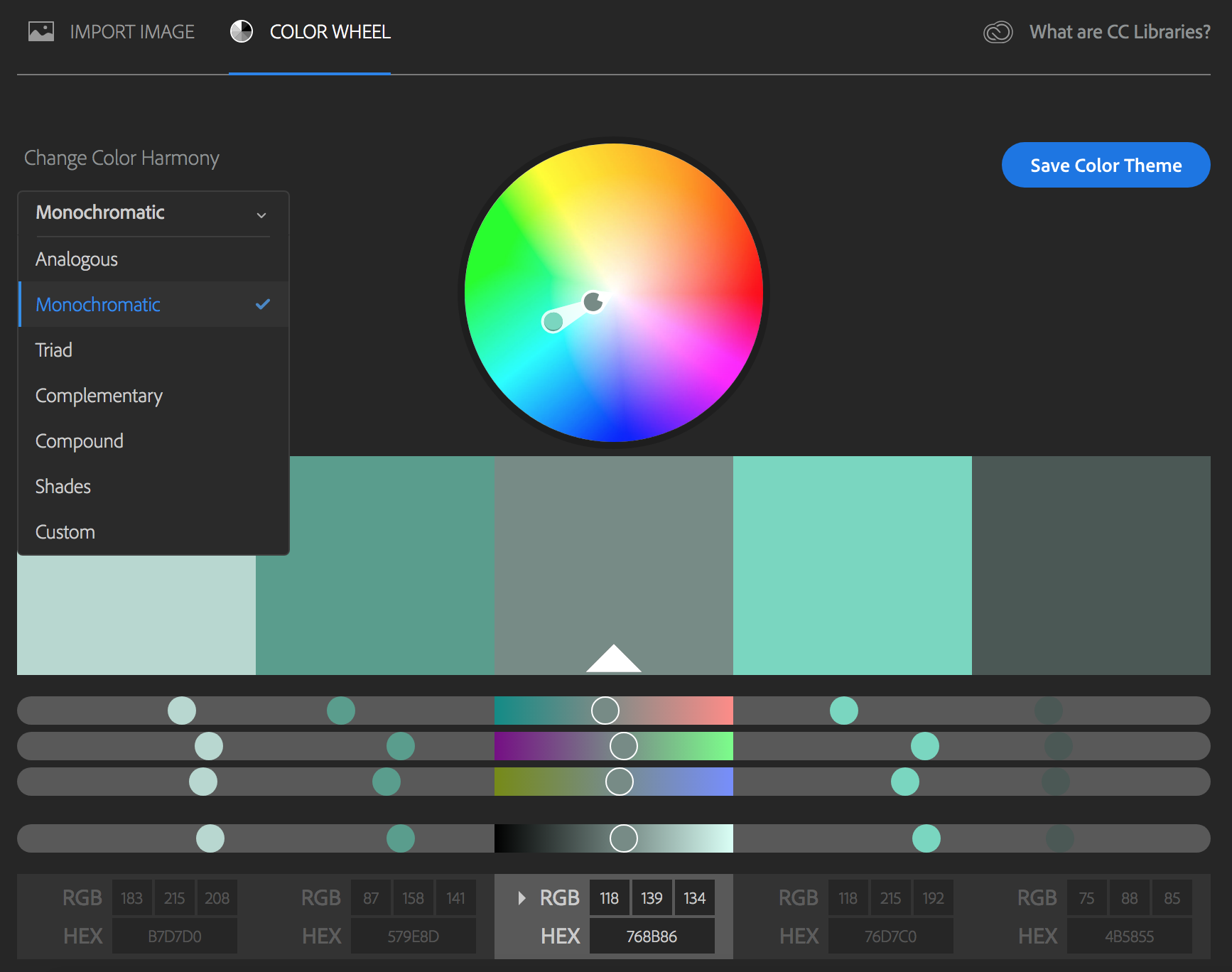
This page starts with a color wheel customizer, but in the upper-left corner is a toggle for “Import Image.” Choose this option and upload your inspiration.
The program will create a 5-color palette based on hues in your photograph. Have fun moving the color pickers around to customize your set, or explore the “Change Color Mood” options.
Return to the Color Wheel screen to adapt your colors further and record the specific formulas for each hue (hint: RGB is for digital production, like Photoshop, and HEX is for use on your website).
What if I Have a Base Color Already?
Some clients come in with a cornerstone color, and this is fantastic! We all know brands that have very successfully built an iconic brand on a single core color (Tiffany blue anyone?).
If you have a color already chosen, you can use this as your “base” on the Color Wheel page (there’s a white border and triangle on the palette’s base). Then explore the “Change Color Harmony” selections, or adjust your palette with the hues and saturation sliders.
Your Final Product
Your brand needs at least one core color. From there, you may choose one or two secondary colors, and be sure to include complimentary neutral colors, as well. You’ll want at least an off-white, an off-black, and some kind of mid-tone. Choosing colors for these neutrals rather than simple black or white can add a subtle polish that stands out from the competition.

Always come back to your 3 Words and how your palette embodies them:
Elegant, dignified palettes often have fewer colors but higher contrast – perhaps using only black, white, and a single accent color.
Less contrast (either monochromatic or lower saturation) generally evokes calm or soothing feelings.
Bright colors, especially a wider variety of them, can create more dynamic energy.
Cool colors (blue, green, and purple) are often more soothing, while warm colors (red, yellow, and orange) can be more energizing. (Of course, there are also warm greens and cooler reds, etc, so don’t get too locked in here!)