Alright, you’ve figured out your values and the tone you want to convey. Now it’s time to tie those concepts to actual visual elements.
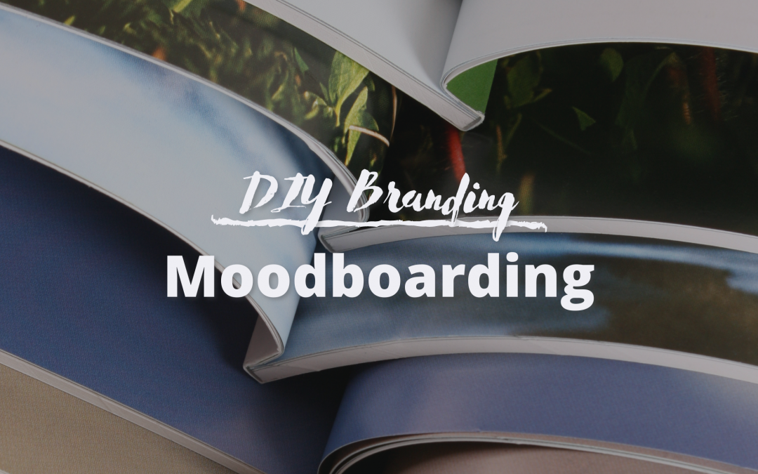
The first place we begin is what’s called a mood board. You can think of this like a scrapbook page of images, colors, and other graphics that set a certain mood.
It’s not just about the individual pieces, but about how they all come together and set a tone with just a glance.
There are a lot of tools you can use to create a mood board — whether physically cutting images out of magazines or collecting images in a digital format (I love using Pinterest). Take a look at a few image collection tools you can use.
The key is to collect everything, then distill into the final product.
1. Build a Collection — no filter allowed
The first step is collecting ideas. This is an exploratory stage, so everything goes. Try to keep your focus specifically on the business, product, or concept you’re building at the moment and release thoughts of other side projects.
The only rule is to stay focused and present with your current brand. Collect all of these ideas on one master mood board.
Don’t filter yourself
Grab anything and everything you see that you think relates to your brand or the tone you want to set. The point is to explore what appeals to you, then find patterns in that collection and distill into a refined concept. But start broad.
Think in both motifs and colors
It doesn’t always have to be from your industry or niche. Be broad, and look for.
Literal imagery — if you’re a baker, look at bread, ovens, people eating, etc. If you’re teaching riding lessons, find images that reflect your barn type, property, and target demographic.
Colors that set a particular tone — these might be dark and moody, light and airy, bright and dynamic, etc. You can also explore multiple types of tones and then filter these later (see “buckets” in the filtering step).
Associated imagery — that baker may want a more natural aesthetic and find inspiration in lakes and ponds and open space. Or they may find inspiration in moodier aesthetics like dramatic clothing fashion or even architectural styles.
Just keep in mind why you grabbed each particular image.
Go down the Google (or Pinterest) rabbit hole
Let your searches develop over time. If you start seeing something you like, maybe use keywords to find more imagery like it. If you feel like something is missing, search for keywords specifically tailored to find those results.
Just set yourself some time limits — maybe set aside an hour or two to collect inspiration. Then get back to work!
It’s best to move into the next step, filtering, with a little bit of mental distance from your original search.
2. Begin to Filter
Here is where you start to refine. Nothing you chose before is wrong (though sometimes I go back and think, “where did that idea come from??” — and that’s totally fine). But now you’re going to find the cream of the crop.
This will take several stages. If you’ve done step 1 correctly, you will likely have a LOT of images to sort through. I often do at least 3 rounds of filtering images before I have a final mood board. And that’s already starting with solid concept of what I want. So be patient.
There are a couple of methods to filter from a large collection to a curated one.
Sort into Buckets
If you’re exploring a variety of tones and moods, you may want to set up a handful of secondary “master” boards based on a few options for aesthetics. Possibly create one that is “light” and another that is “dark” or “colorful.”
Then move on to refine each of those boards further.
Rank Favorites & Filter Out
One method that works well for me it to have some sort of numbering system — I use stars to rank my preferences:
1 star is an outright reject (it looked cool on its own, but doesn’t actually fit my values or tone)
2 is ok, but not terribly exciting or on-brand
3 would totally work, but may not be very inspired
4 is a favorite, something I really like, and
5 is a must-use, can’t-live-without piece of cornerstone content
Once you’ve filtered out the 1s, 2s, and even 3s (we’re going for a narrow lineup here), go back through and do it again with your 4s and 5s. You’ll be surprised that some of those will still fall off the ranks.
Filter Up
Similar to ranking images, this technique helps move your favorites “up” to a new board. Starting with your master collection, create a new board (i.e. “favorites round 1”), and just go through and grab what stands out to you as particularly awesome.
Then do it again for that collection (create a new “favorites round 2” board).
You’re going to start seeing some trends emerge, and this is the goal. At the end of the day, you want graphics that set a clear and consistent mood or tone.
Final Product
At the end of the day, you want to finish with maybe 7-15 images that really make you feel the way you want your clients to.
You will consistently reference this collection as you choose colors, select fonts, and build your graphics library. It may even influence some of the language you use in your brand story and marketing messages.